Kia Motors Corporation trademarks new logo design in South Korea.
There is no denying that Kia have made massive strides in the global automotive market over the past decade or so.
Great vehicles like the Soul, Stinger, and Telluride have become incredibly popular among the buying public, helping the Kia brand become one synonymous with quality cars at a great price.
Every vehicle that Kia brings to market comes with the company logo on a badge in front and back, with the current logo in place since 1994. Initially, that logo was put in place to celebrate Kia’s 50th anniversary, and while it underwent a minor tweak in 2004, it has mostly remained unchanged.
That may be about to change, though, as word has it that Kia are about to deliver a serious upgrade to their logo design.
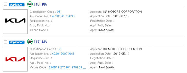
According to KIPRIS (Korea Intellectual Property Rights Information Service), Kia have signaled their intent for a logo change by submitting no less than 50 trademark registrations since May of this year.
What do the trademarked Kia logos look like?
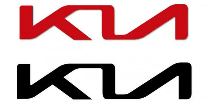
The trademarked logos consist of a space age looking version of the word “Kia” in both red and black set against a white background.
We have the images available for you to look at here, but you can also head on over to the KIPRIS website to see them there, too.
Is the logo change for the entire Kia line-up or just EV models?
The question now is whether the new logo will appear on all Kia vehicles or reserved for a select few.
Insider sources seem to feel that the new logo will only be used on upcoming Kia electric cars and hybrids, which would see the likes of the Soul and Niro EV models get the new badging.
That is not the only opinion, though, as other sources believe that the new Kia logo will make its first official appearance on the production version of the “Imagine by Kia” crossover vehicle. That particular model, and EV with a range of more than 300 miles, is not expected to hit the production line for another two or three years.
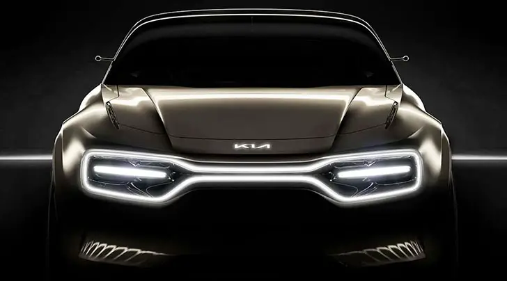
It is worth noting that when the “Imagine by Kia” concept model was shown off at this year’s Geneva Motor Show, it did feature the new Kia logo as an LED-illuminated version on the hood and steering wheel.
At that time, the new logo received rave reviews from automotive journalists and reviewers.
What are your thoughts?
Now that you know that a new Kia logo is in the works, we want to hear your opinion. Do you like the new look, and do you think it should be applied to all Kia models or just on the EV’s and hybrids? (Source: Drivetribe)

We need to move with times we cant be left behind, change is good and i think they should include the logo on all cars and make the logo available for those who have the old one to replace it with the new logo.
I like it! I just bought my first Kia and I said to my husband, “they need a cool Logo! Rather than just the word Kia spelled out so simply”
Cloe, the old one is simple and nice but it’s a bit similar to Lexus and Kin Long. You can find the embedded K…. I changed mine.
I changed my KIA logo on my 2020 Telluride to the “K” Lexus style logo. I welcome a new logo and hope they make it available for every vehicle old and new
Bought a kia pro ceed 6weeks ago & waaaaaaw I love it, never even thought about looking at kia until my partner spotted the car on the forecourt.
Not really bothered about the kia badge as the car is awesome, once I’ve paid the finance off I’ll be going for a ceed gt hehehe
I just bought my 4th Kia and I love the old logo. My 2020 Telluride is amazing no matter what the logo lookes like……;)
Bought a kia pro ceed 6weeks ago & waaaaaaw I love it, never even thought about looking at kia until my partner spotted the car on the forecourt.
Not really bothered about the kia badge as the car is awesome, once I’ve paid the finance off I’ll be going for a ceed gt hehehe
They make new trend of a car logo. Most logo has a graphic images from a letter like L for lexus, T for Toyota, H from Hyundai and VW. But Kia make a logo from all letters without graphic image. And it is beautiful. I like it on the car and guess it will improve the brand value.
I love my Kia Sorento and the Logo is fine but I really like the new one Red stands out nicely
I think the new logo looks like the letters KU with a cursive kind of look. Where’s the IA?
Who cares about a logo honestly? What matters most to me, and probably a lot of other people is that Kia keep making desirable, stylish, interesting and reliable cars! #KiaThePowerToSurprise in a good way and that is testament to their 7 year or 100,000 mile warranty! PS Kia you can drop my free new car around anytime you want LOL.
Looks great!
I don’t like this logo.
I love the new logo….it should be on all Kia’s to show how they have moved up in the world
They Need to Put The “Model Image” or An icon on The ” i ” lnstead of The Period or dot.
Webby, completely agree, the Proceed is amazing. I have a GT in white and the number of BMW, Audi and Mercs that give it at least a second look, or, my favourite, drive alongside on a motorway to look, before overtaking slowly. I then just accelerate past them, particularly the A-Class 2 litre diesel, which seems to be the car of choice for young reps these days.
I would give Kia another 5-10 years and they will be talked about like Toyota, or Lexus. The way the quality of the Germans is going downhill they will lose there podium quickly.
I like this logo 👌👌 👌.
This is owsame..
If it ain’t broke don’t fix it.
I hate the current simple logo and welcome change. All of my 5 KIAs had the K logo like Lexus. Ford is the only other brand that has the same as logo. You will increase sales with K logo or with a similar style logo without the word KIA.
I like the new logo.
Looks like ” KN” Must work on better one. The design and performance are taking off and the new logo should be as well. Kudos to Kia~!
Kia must retain the Kia Soul especially that it was upgraded it looks sleek and must have at least four variant to compete with other brands of car, the price range from $ 17,500 to $ 23,400. Im sure Kia will have a bunch car sold in the Philippines.
I don’t like the newest iteration of the KIA Logo. The “I” is not prominent enough and it looks like just 2 letters as others here have said. Go back to the drawing board if you want to “improve” upon the already well-recognized, efficiently designed KIA logo that currently adorns all the Kia models.
I drive a 2018 Kia Niro LX and love it… w/plans to upgrade to the 2020 Kia Niro LX at the end of this year. This prototype “futuristic” logo needs more design work to replace the stellar KIA Logo flagship icon.